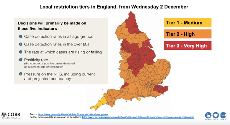
England has emerged from lockdown and entered the second phase of its tier system – in which different parts of the country are placed under a different set of coronavirus restrictions. The scheme has been controversial, with many pointing out that the system is more heavily applied in the north of the country, which has been hit hard by the disease.
What are we to make of the geographical differences in infections and deaths from COVID-19?
gov.uk
You would expect that when the proportion of people testing positive for COVID-19 rises, the number that subsequently die will also rise – but this article illustrates that, following the first wave and the fall to low numbers of daily cases in summer, it has been only since autumn that this can actually be seen to be occurring clearly, and then only for people aged over 70. More than 80% of all those who died in England with COVID-19 mentioned on their death certificate have been in this age bracket.
To help us understand the geographical relationship between testing positive for this disease and dying from it, it is helpful to concentrate on these over-70s. One reason for this is that modelling has suggested that at younger ages cases may rise, but the total number of deaths fall if those younger people mix less with older people; and young people, once infected, have a significantly lower chance of dying from COVID-19.
Since May 2020, researchers working for the Office for National Statistics (ONS) have been conducting a COVID-19 infection survey which reports estimates of the proportion of people infected in each region of England. We can use this data to shed some light on the issue of geographical differences in the spread of coronavirus.
How COVID hit the north first
According to ONS data, in the first two weeks of September only 84 new infections were found in the English survey out of almost 90,000 households that were being tested each week at that time. But as the number of people sampled rose to more than 200,000 households per week, and as the disease spread more rapidly, just over 1,000 new infections were being recorded in the middle two weeks of October.
The first graph below shows there was no clear geographical relationship between the proportion of people aged 70 or older who tested positive for COVID-19 in the four weeks to September 19 and the numbers who were recorded as having died with COVID-19 mentioned on their death certificate in the week after. Both the disease and deaths from it had become rare in August and September, but that situation would quickly change.
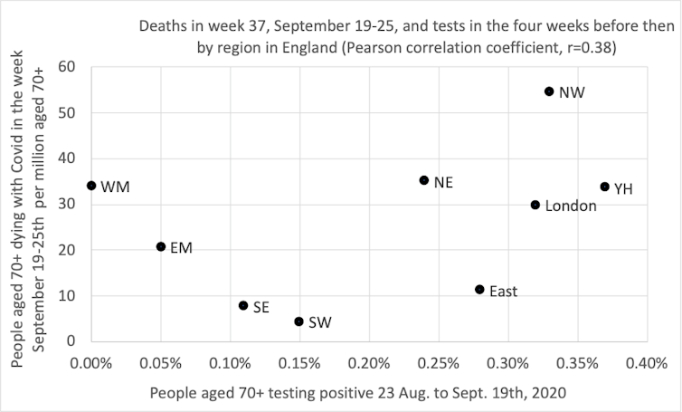
Danny Dorling, Author provided
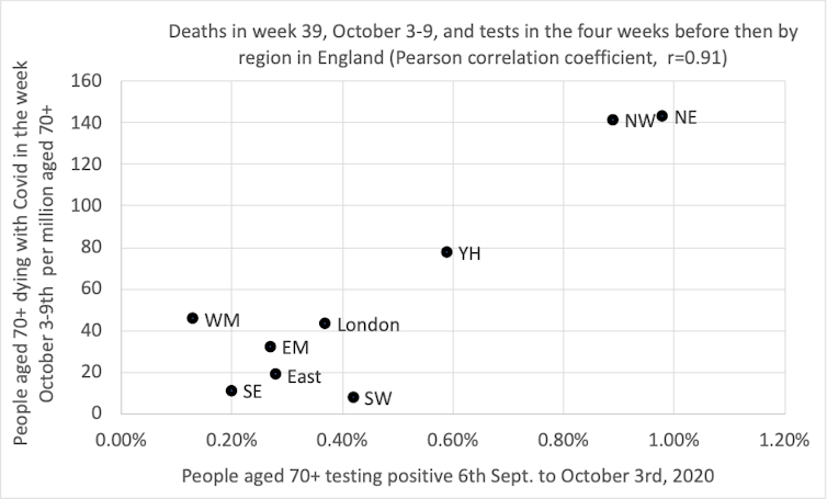
Exactly two weeks after the situation described above, the picture was very different. Indeed, we had to update the horizontal and vertical axis scales on our graph due to the increases in cases and deaths in the north.
By October 3, cases had risen the most in the north-east of England (the most northern region in the country); by almost as much in the north-west (the next most northern); and by half as much in Yorkshire and Humberside. Deaths in all three of these regions rose similarly in the week starting October 3.
Danny Dorling
Did the rates of infection rise most in the north of England because autumn starts earlier further north? We do not know. The rises in COVID-19 this autumn have been geographically distinct; but then so too is the onset of autumn. As all gardeners know, autumn always begins in the north of England and sweeps down to the south-west, arriving there last of all.
Other factors to consider are regional variations in susceptibility by the autumn – in August 2020 the ONS found that only 3.9% of people in the north-west were found to have antibodies to SARS-CoV-2 as compared to 10.0% in London, meaning that in London there were more people with higher levels of immunity. COVID-19 may also have spread more quickly in the north-west because there are more essential workers in these regions who cannot do their jobs from home. More may live nearer to their elderly relatives and rely on them for childcare, or be medically more susceptible to catching or dying from the disease.
What we do know is that when the proportion of people over 70 who tested positive rose in the four weeks before a particular date in a region, the proportion of people of that age who died in the week after that date similarly rose. This relationship is also stable, but not quite as strong, if you move that four-week window back by two weeks.
A clearer picture
It is what happened in the subsequent two time periods which most clearly suggests that there is a now a strong and strengthening geographical relationship between infections among the elderly and mortality overall.
Every two weeks, as another batch of survey data was released, the picture became more convincing because it is repeated with independent ONS data, collected for a new time period along with data from the Imperial College London REACT study.
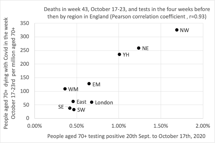
In the four weeks before October 17, there is still not much of a pattern between cases and subsequent deaths in more southern regions where fewer than 1% of those under the age of 70 tested positive at that time. But the northern regions of the country showed a strengthening relationship.
Danny Dorling, Author provided
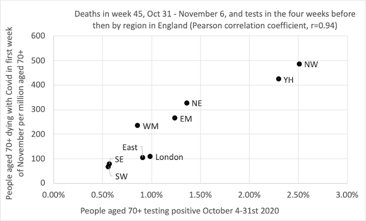
The most recent picture is shown in the graph below. Now there is an even stronger correlation between prior positive tests and subsequent deaths. The north-east has fallen back one more place, and both Midlands regions are rising slightly. It was on the day before the end of this most recent period, on November 5, when the UK entered its second nationwide lockdown.
Danny Dorling, Author provided
By early November 2020, when 1% of people aged over 70 tested positive for the disease in a month in any region, as many as 200 per million people of that age group would die in the next week. That proportion could be lower if people who are more likely to catch the disease are less likely to take part in the ONS survey (which is very possible). Infections had risen most in the north, and then in the Midlands.
What happens next is unknown – the testing data up until November 14 has already been released, suggesting a possible fall in deaths in the eastern, east Midlands and Yorkshire and Humberside regions in future weeks and a plateauing in the north-east, north-west and London.
There are many reasons for why this might occur, including both a possible fall in the proportion of people who are most susceptible where the disease has already spread the most, and possibly also greater voluntary isolation of people aged over 70 as it has spread. But as England exits full lockdown and re-enters tiers, the full effects of colder weather are yet to come.
![]()
George Davey Smith is Director of the MRC Integrative Epidemiology Unit at the University of Bristol, which is supported by the Medical Research Council (MRC) and University of Bristol
Danny Dorling does not work for, consult, own shares in or receive funding from any company or organisation that would benefit from this article, and has disclosed no relevant affiliations beyond their academic appointment.


