With the slated reopening of schools in the UK around the corner, it’s critical to know if cases of coronavirus are going up. If so, further loosening restrictions could significantly exacerbate the problem.
Chris Whitty, the chief medical officer for England, told the press on July 31 that “we have probably reached near the limit or the limits of what we can do in terms of opening up society”. Clearly, Whitty believes that the UK is in a situation where cases might start to rise again – if they haven’t already – given further easing.
Whether or not cases are rising should be easy to figure out: just look at the number of positive cases per day and see whether they are increasing or decreasing, right? Unfortunately, it’s not that simple.
First, we need to understand the different tests that are carried out. In the UK, tests are conducted through four different routes or “pillars”. Pillar one is tests done in healthcare environments, such as hospitals. Pillar two is tests in the community. (These first two pillars give us the day-to-day variation.) Pillar three is antibody testing to see who has had the disease. And pillar four is testing for research purposes, such as the weekly randomised sampling carried out by the Office for National Statistics to estimate who currently has the disease.
Looking at the changes in pillar one and pillar two testing over the last few weeks (see the figure below) it is possible to discern that there has been a small increase in the number of positive tests recorded.
Author produced with data from https://coronavirus.data.gov.uk/cases
But this isn’t the whole story. Testing has increased over that period, too. Even assuming flatlining of cases, more testing will pick up more positives, giving the appearance of an increase in cases. Since the increase in positive cases detected in pillars one and two is only relatively modest, perhaps it can be accounted for by the increase in testing? If the rise in positive tests is genuinely due to a rise in cases, we would expect the proportion of positive tests to increase, not just the number of positive cases.
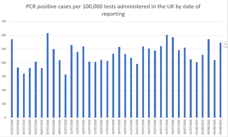
To find the proportion of positive tests, we can divide the number of positive tests by the number of tests carried out. The graph below takes the number of cases reported on a single day and divides that by the number of “tests processed” on that day. There are potentially some lags between tests being processed and reported, so this won’t give exactly the right figures, but it illustrates the importance of considering the proportion of positive tests, not just the absolute numbers.

Author created with data from https://coronavirus.data.gov.uk/cases and https://coronavirus.data.gov.uk/testing
Given the variation in the data, it’s now much harder to be confident, by simply looking at the graph above, that the proportion of positive tests is increasing. Carl Heneghan, a professor at the University of Oxford’s Centre for Evidence-Based Medicine, collating cases by the date of sample rather than the date of reporting, has even suggested that the proportion of positive cases might be decreasing.
But this isn’t the end of the story either because of an issue in the way that tests are reported. Christina Pagel, a professor at University College London, pointed out that the number of “test processed” almost certainly includes multiple tests per person – the same person being counted as one case but being tested at least twice. For example, in the week beginning July 16, around 545,000 pillar-two tests were processed, but only 240,000 people were actually tested.
We should really be dividing positive tests by the number of people tested to find out whether the proportion of positive testing people is increasing. The good news is that this data is available on the NHS test-and-trace report website. The bad news is that the data is only reported weekly and lags by around a week. Still, the data shows that the number of tests processed is increasing more quickly than the number of people tested.
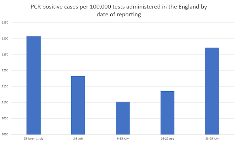
When the number of weekly pillar one and pillar two cases are divided by the number of people tested, the proportion of people testing positive in England appears to fall until mid-July. However, it has shown consistent rises for the last two weeks (see the chart below).

Author prepared with data from https://www.gov.uk/government/collections/nhs-test-and-trace-statistics-england-weekly-reports
This seems to support the conclusion of the Office for National Statistics survey that cases have been rising slowly for the last few weeks. The ONS survey consistently samples a random subset of the population and scales up the proportion of positive tests to give an estimate for cases across the whole country. It is, therefore, unaffected by changes in the number of tests carried out.
So are cases rising? Well, maybe. But maybe not. Local hotspots, such as Leicester and Greater Manchester, will almost certainly invite more intensive testing. If testing in these areas is picking up a higher proportion of people who test positive, then this could also lead to a rise in the proportion of positive tests across the country without the disease necessarily increasing everywhere.
There is certainly a lot of nuance when it comes to solving the problem of whether cases are genuinely rising or not. But it is a problem the UK government must solve – and solve quickly – if it is to be able to plan effectively and react swiftly as autumn approaches and the country moves into a crucial stage in the handling of the epidemic.
![]()
Christian Yates does not work for, consult, own shares in or receive funding from any company or organisation that would benefit from this article, and has disclosed no relevant affiliations beyond their academic appointment.


